Warm neutrals, natural-looking wood grain, green and blue tones, and contrasting cabinet finishes are useful directions to explore in a 2026 kitchen brief. For a project buyer, the next step is choosing materials and finishes and defining what the sample approval must cover.
This guide, reviewed October 24, 2026, presents a selected palette for projects being specified in 2026. The finishes are established design choices; their inclusion is not a claim of a newly emerging trend. The guide does not rank these finishes by sales or claim that one palette suits every project. A reference image can establish a visual aim, but the order still needs to identify what is being made.
Turn the Look into a Set of Decisions
A surface system describes how the decorative face is made, such as a painted coating, real-wood veneer or a printed decorative surface. A trend label leaves several purchasing questions open. “Natural oak,” for example, might describe a timber species, a veneer or the appearance of a printed surface.
| Visual direction | What to decide before ordering |
|---|---|
| Warm white, mushroom or taupe | Actual color reference, surface system, sheen and where the finish is used |
| Light oak, elm or walnut look | Real wood or printed appearance, underlying panel or frame, grain direction and sample range |
| Green, blue or dark accent | Exact cabinet locations, adjacent finishes and matching exposed pieces |
| Two-tone or mixed-finish kitchen | Which components deliberately differ and which must match |
Keep the appearance separate from the underlying construction. The Cabinet Material Guide explains the distinction between a box panel, a door core and its decorative face.
Warm Neutrals Need a Specific Color Reference
Warm whites, mushroom shades and taupes can give a kitchen a softer palette. Those names cover a wide range of colors, so they are useful starting descriptions but incomplete order references.
Review the intended finish beside the countertop, floor and wall finish. View the samples together in the project's planned lighting where practical. A neutral that works against one stone or tile can read differently beside another.
Record the color and sheen for the selected surface system. Two products described as matte taupe may have different texture, reflection and edge appearance. If the cabinetry combines painted doors and a decorative panel, approve the intended relationship between them.
Include fillers, visible ends and toe kicks—the recessed base pieces below the cabinets—in the color plan. These small pieces can reveal an unintended mismatch even when the main doors look consistent.
A Natural Wood Look Does Not Identify the Material
Light oak and elm looks offer one direction; walnut tones and more expressive grain offer another. The purchasing question is how that appearance is achieved.
Solid-wood details, veneered panels and printed decorative surfaces have different constructions. Veneer is a thin real-wood layer over a supporting material. A printed oak appearance is not an oak veneer, and a veneer face does not identify the material beneath it.
For real wood or veneer, identify the species, coating and grain arrangement. Agree on the range of natural variation that the approval is intended to cover. For a printed decorative surface, identify the product code, texture, edge treatment and grain direction.
Review the pattern at the size and orientation of the intended fronts. A small swatch may not show a prominent grain feature across a tall door or several adjoining drawers. Mark the direction on the front-view drawing so the sample approval can be carried into production. If the grain is intended to align across adjoining fronts, record that requirement separately from its direction and review what the selected product can achieve.
The Thermofoil and Laminate Guide explains why similar wood-look colors can still come from different surface systems.
Place Color and Contrast Deliberately
Muted greens, blues and deeper accent colors can be used on an island, lower cabinets or a selected tall unit. The same idea can be applied through a wood finish beside painted cabinetry.
Specify the location of each finish on the drawings. “Blue island” may leave the island's back, exposed ends, interior, toe kick and decorative details undecided.
At every junction between finishes, establish which color or material continues around the corner. This is especially useful for an island seen from the living area, where the back and ends are part of the design rather than concealed surfaces.
Handles and other visible hardware should be reviewed with both finishes. Keep the appearance of the handle separate from its dimensions and attachment requirements; choosing a color does not settle whether the handle fits the front.
Review a Coordinated Set of Samples
A collection of individually attractive samples may still be an unclear kitchen specification. Bring together the finishes that will be seen next to one another.
A useful sample review includes:
-
The main front finish and any accent front.
-
Matching or contrasting edges.
-
Visible end panels, fillers and toe kicks.
-
Handles and exposed metal trim or handle rails.
-
Adjacent countertop, floor and wall-finish references.
Where the door has a shaped face or edge, review a representative finished profile if available. Color and sheen on a flat swatch do not show that detail.
Identify exactly what the sample approval covers. A color approval may leave the substrate—the supporting panel beneath the surface—along with the back finish or hardware unresolved. Record those separate decisions in the Component Material Schedule.
Example: A Two-Finish Kitchen Brief
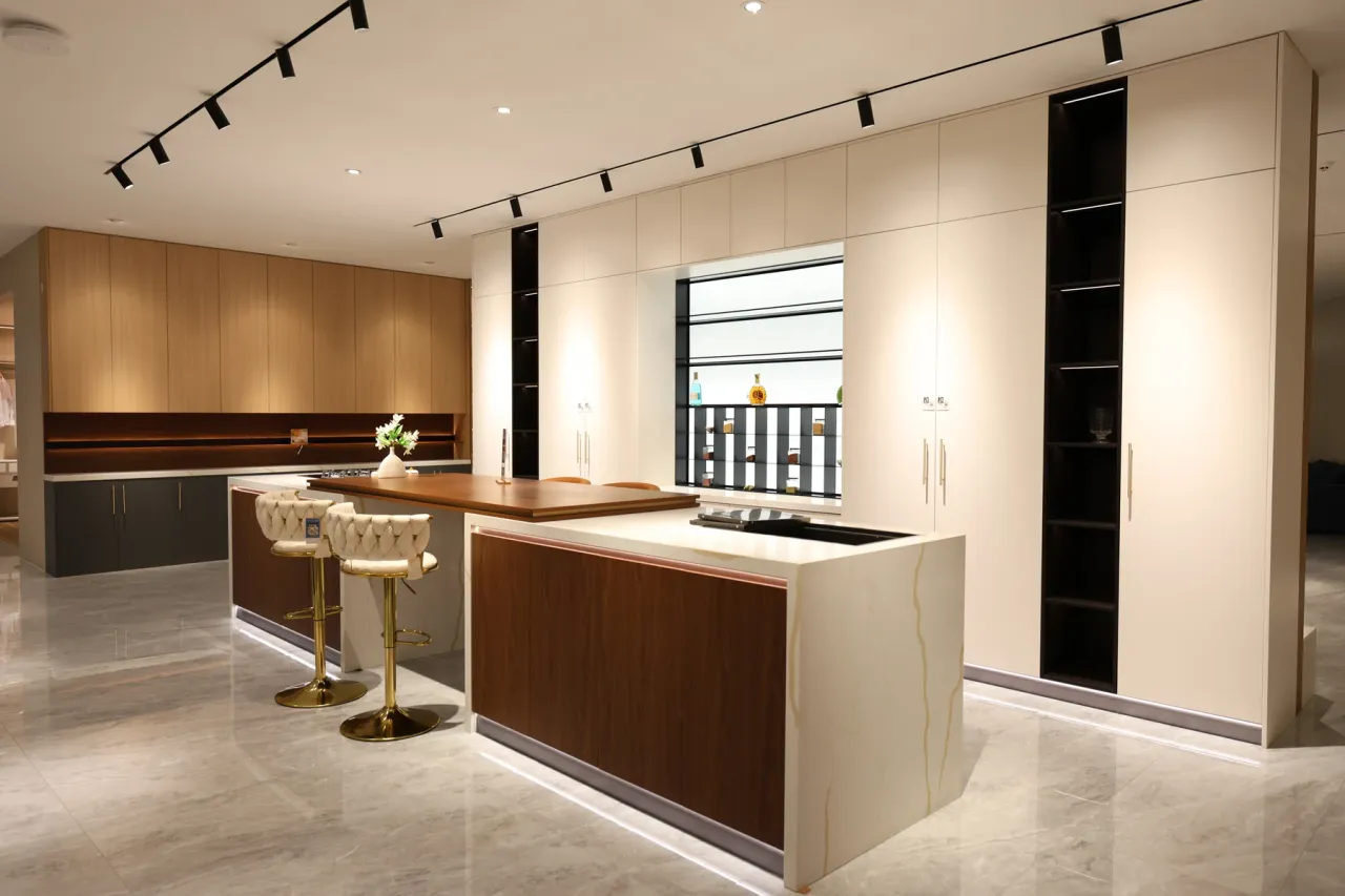
Consider an illustrative design with warm neutral cabinets along the walls and a walnut-look island. This is a planning example, not a record of an actual George project.
The design brief can be developed as follows:
| Area | Visual choice | Specification decision |
|---|---|---|
| Cabinets along the walls | Warm neutral fronts | Select surface system, color, sheen and front construction |
| Island fronts | Walnut look with vertical grain | Decide veneer or printed surface, then identify finish and grain reference |
| Island back and ends | Coordinate with the island fronts | Define whether they use the same material and how corners meet |
| Fillers and toe kicks | Match the adjacent cabinet group | Assign the correct finish to each location |
| Handles | One visible finish across both groups | Confirm dimensions, attachment and appearance with both samples |
An offer that uses a printed surface instead of veneer may preserve the broad visual direction while changing the product. Record that change openly. Decide whether it is acceptable before treating the quote as equivalent.
This approach keeps intentional contrast separate from accidental mismatch. It also tells the sample reviewer which surfaces to compare together.
Keep the Selection Useful After the Design Decision
A kitchen's finish records need to remain understandable after the trend discussion is over. Keep the selected surface codes, samples, grain direction, front construction and hardware references with the final drawings.
Retain care instructions for the actual surfaces. A matte look, wood appearance or warm color does not establish scratch resistance, compatibility with cleaning products or service life.
Before approving production, use the Specification Approval Checklist to resolve the remaining component decisions. For a project inquiry, the Cabinetry and Wardrobe Page explains the plans, quantities and finish preferences to prepare.